
Today the Chicks are pleased to welcome Judy Penz Sheluk, author, editor, and publisher extraordinaire, whose newest anthology, Larceny & Last Chances, released just last month. Take it away, Judy!
THE FINE ART OF COVER ART
It’s said a good cover can sell a book. I’m not sure if that’s true but I do know, from personal experience, that some of my books have better sales than others, and I like to think they’re all equally fabulous (there being no place for humility in Shameless Self Promotion).
One thing I learned early on is that each book in a series should have similar branding. I’ve taken that one step further – all my books have the text placement for series name, title, subtitle, and author name in the exact same spot, though the font, backgrounds, and imagery for each are different. Those differences are determined by the first book in a series, which essentially “sets the stage” for the rest.
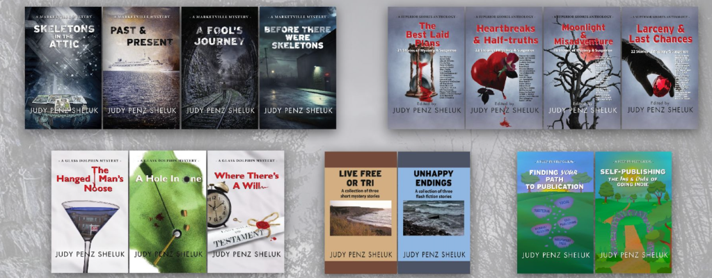
In the case of the Superior Shores Anthologies, I had very definite ideas about the overall look I wanted to achieve. Moody background. Pops of blood red. Every author’s name listed. My phenomenal graphic artist, Hunter Martin, was equal to the task, and the cover for The Best Laid Plans was exactly what I’d envisioned.
Subsequent books in the series—Heartbreaks & Half-truths and Moonlight & Misadventure—continued the theme, though I think you’ll agree that the cover for Heartbreaks is the weakest of the lot (and the sales, the lowest, even though it’s a great collection). That weakness is all on me. I had commissioned and paid for artwork and Hunter did his best with it. It’s one of those cases where I should have cut my losses and moved on to Plan B. I didn’t, but I did learn my lesson with Moonlight, leaving 100% of the design to Hunter (though I did suggest creepy trees and a blood red moon).
When it came time to design the cover for Larceny & Last Chances, the fourth book in the Superior Shores Anthology series, I was out of ideas. “Maybe an old west Last Chance Saloon?” I asked Hunter, not really feeling it. “Are there saloons in the book?” he’d asked, and I admitted there wasn’t a single one, though there had been a few stories submitted with jewelry as part of the angle (spoiler alert: only a couple of stories include jewelry!).

Hunter’s concept of a black-gloved hand holding a red ruby was nothing I could have ever imagined. And yet, the moment I saw it, I knew it was absolutely perfect. I hope you agree…after all, good covers sell books. Or at least, that’s the theory.
Readers: Is there a series you love that features coordinated cover art?
About the book: Larceny & Last Chances: 22 Stories of Mystery & Suspense (edited by Judy Penz Sheluk):
Sometimes it’s about doing the right thing. Sometimes it’s about getting even. Sometimes it’s about taking what you think you deserve. And sometimes, it’s your last, best, hope. Edited by Judy Penz Sheluk and featuring stories by Christina Boufis, John Bukowski, Brenda Chapman, Susan Daly, Wil A. Emerson, Tracy Falenwolfe, Kate Fellowes, Molly Wills Fraser, Gina X. Grant, Karen Grose, Wendy Harrison, Julie Hastrup, Larry M. Keeton, Charlie Kondek, Edward Lodi, Bethany Maines, Gregory Meece, Cate Moyle, Judy Penz Sheluk, KM Rockwood, Kevin R. Tipple, and Robert Weibezahl.
Buy Link: http://www.books2read.com/larceny

About the editor: Judy Penz Sheluk is a former journalist and magazine editor and the bestselling author of two mystery series, several short stories, and two books on publishing. She is also the publisher and editor of four Superior Shores Anthologies. Judy is a member of Sisters in Crime, International Thriller Writers, the Short Mystery Fiction Society, and Crime Writers of Canada, where she served as Chair. Find out more at http://www.judypenzsheluk.com.

Thanks for hosting me again, Chicks! Love your blog and I’m a faithful reader. And I’m happy to answer any questions too.
LikeLiked by 1 person
Thanks for having me!
LikeLiked by 2 people
I love your anthology covers, Judy. There is always a cover in a series that is weaker than the rest.
LikeLiked by 1 person
True that, Liz! And thank you.
LikeLiked by 2 people
Judy, I liked the Heartbreaks cover!
LikeLike
I would say Hunter is a keeper! It’s nice to have a cover designer with the confidence to take a cover in a different direction when something isn’t working. Maybe at some point you’ll do an anthology with Last Chance Saloon stories?
Congratulations on your recent release!
LikeLiked by 1 person
Thanks Amy, yes, love Hunter!! And thanks for the congrats. I think I’ll pass on the saloon stuff though 🙂
LikeLike
Thanks Amy! No plans to do a saloon series though 🙂
LikeLiked by 1 person
Covers are so very important, as is having ones that match for a series, and yours hit the spot, Judy!
Thanks so much for visiting the Chicks today, and congrats on the release of LARCENY & LAST CHANCES!
LikeLike
Thank you Leslie for all the work you did behind the scenes for me and thanks for your kind words.
LikeLiked by 1 person
Judy, you’re incredible! AND you introduced me to Hunter, who I couldn’t live without now. Aside from my own series, lol, I adore the covers on Alyssa Maxwell’s Gilded Newport Mystery series. They’re by Stephen Gardner, the same artist who did my Cajun Country Mystery covers and he’s fantastic. I love how each book in her series features one of those elaborate Gilded Age Newport mansions. And the colors! You want to jump into her covers.
LikeLike
Thanks Ellen! It’s great when you find a good cover artist.
LikeLike
Most of the series I read have similar cover designs, unless the series changes publishers. Sometimes, with that change, there is a big shift. Other times, they are still similar.
Different series from the same author will often look very different, even if both series are from the same publisher, however.
LikeLike
True, Mark, some publishers will take a very different approach than I do. What does bug me is when a huge press does covers for different authors that are all basically the same (Lighthouse/white picket fence/woman running in a red coat). Seems a bit unimaginative.
LikeLiked by 1 person
Yes, those repetitive covers make me wonder. I get that they are telling us what kind of book it is (genre, etc.), but can’t we get some variety? Different color coats, maybe?
LikeLike
Congrats, Judy, on your latest anthology! It takes so much to coordinate the look across a series. Love how you can rely on Hunter to create a fabulous cover concept.
Not sure if I have a favorite series, but I do appreciate when I have books displayed on my bookshelf that keep with the same pattern–including those spines!
LikeLiked by 1 person
Good point on the spines, Jennifer! Thanks for your congrats.
LikeLike
All the series I love keep the same patterns for each book in the series. I assumed it was like Times New Roman size 12 font ( ;
Thanks for this cover-featured post. very intriguing.
LikeLiked by 1 person
Hi Pamela, well, that’s the way I do it, I expect some others do it differently!
LikeLiked by 1 person
hestia here.
the first thing I look at is the title, and then the cover. I believe most like a cover that resembles the genre. But certain genres I like a shock factor in the cover.
that’s the fun thing about anthologies. You have a theme, but the cover art can be anything. A cozy mystery anthology doesn’t have to be cute, like most of the covers are. You can go elegant, simple, complex, maybe even a graphic that highlights only one story in the book. Then you have to keep reading until you figure out the representation.
and I’m not particular about “matcha-matchy”, for lack of a better word.
although, in Sixth Sense, the color red was significant, which I thought was cool. Your one series reminded me of that.
that’s my two cents.
,
LikeLiked by 1 person
thanks for weighing in!
LikeLike
Thanks for being here, Judy, and I love seeing the covers all laid out!
In advertising (my day job), we talk about visual continuity and how you should be able to cover a logo (or in this case, the author’s name) and still know the “brand.” I’d say mission accomplished here!
LikeLiked by 1 person
So true, Kathy! And I guess for mysteries there are 3 “brands”: the sub-genre, the series, and the publisher. Yikes! Guess that’s why they boil everything down almost to a code, so the potential reader can identify and evaluate the appeal of a particular book in a nanosecond (and online, in teensy form). Maybe it’s best not to look at any cover too long, ha.
LikeLiked by 1 person
Thanks Kathleen, sorry for the late response — was at our cottage, limited internet. It was actually when I was at LCC Vancouver and a marketing guru said to me, “you do realize I can’t tell that all your books are in the same series?” and she was right. I had all my covers redone at that point (2019). It cost me financially but I’ve been able to carry it through and it was great advice.
LikeLike
Judy, thanks so much for visiting Chicks, as always! And what a great post–loved hearing about your design journey! Sorry I’m so late to the party–I’ve been away with sporadic Internet, but I’m back on the case now. Congrats on all your success with Superior Shores!
LikeLike
Thanks as always Lisa and Chicks for your support!
LikeLiked by 1 person