
I probably don’t have to tell you that a lot goes into a book cover. There’s psychology, design aspects, color theory, font decisions, genre considerations, and much more. When it all works, you probably can’t say why. You just know it pleases you and makes you want to take a second look at the book.
But when it doesn’t work, it’s usually obvious why it misses the mark.
When you work with a traditional publisher, they have an art department that handles the covers. Usually the editor will ask the author for input about the cover with the understanding the final word is theirs, and theirs alone, and it states that very clearly in the contract. The editor is the middleman between the author and the art department. (Even in picture books, which I find interesting. The author and illustrator almost never correspond about the story.)
I didn’t have any real ideas for the covers of Puzzling Ink (on sale for 99c) and Punning With Scissors (also on sale for 99c), the first two books in my Crossword mysteries, just that the first one showed a crossword puzzle grid, and the second a scissors. (So avant garde, right? That’s why I’m not an artist.) When they showed me the draft of Punning, though, I said, “Uh oh” because Quinn was decked out in a bulky sweater, but the book is set in the heat of August. In fact, there’s actually a scene in the book where she and Virginia Woof, the dog in that one, almost get heat stroke! Luckily they changed it, and Gin even got a primo spot on the cover.
For the third Crossword mystery, Fatal Solutions (on pre-order, out November 9th) I did have some specific things I wanted on the cover. I wanted that daruma doll because it plays a big part in the story, and I thought it was time for Fang, Quinn’s goldfish and sounding board, got a little cover love. Imagine my surprise, though, when I saw the final version and Quinn’s hair changed color and style!


With my independent books, the Mystery Writer’s Mysteries, I have complete control over every aspect of the cover. I was lucky enough to find a designer, Steven Novak, who I think does excellent work. And he’s fast, which I really love.
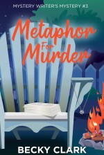
He and I have settled on a “chair theme” for those. Fiction Can Be Murder has the cozy reading chair, Foul Play on Words is set in a hotel during a conference, and Metaphor for Murder has a pivotal scene around a fire pit. It doesn’t take us too long to finalize them. I send him pictures of real chairs that make sense for the story and maybe the other clues on the cover—the key, the Do Not Disturb sign, the necklace and manuscript—and he puts his spin on them.


He and I just finalized Police Navidad (on pre-order, out in December) which was equally fast and painless, but also made me laugh.
We went back and forth a couple of times—star needs to be glittery, boots need to pop more, chair needs to be green, Mystery #3 needs to be #4 … but it took me quite a long time to notice my name wasn’t on it! When I pointed it out, Steven—who is a man of few words—said, and I quote, “Oops.”


I thought you’d enjoy a little peek behind the covers, so I asked some pals if they had any interesting cover stories. (And mystery writers should always have cover stories—ha!)
• Leslie Karst—
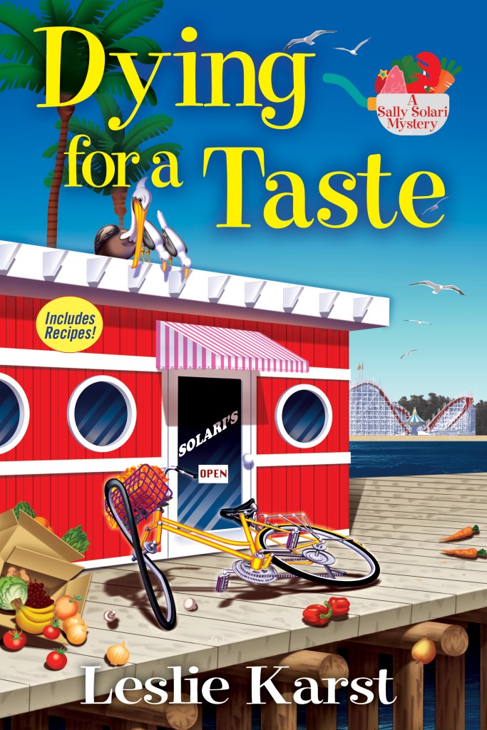
The cover that Crooked Lane originally designed for the first of my Sally Solari mysteries, Dying for a Taste, had the Golden Gate Bridge in the background. A lovely idea, but one major problem: the Golden Gate Bridge is in San Francisco, 70 miles to the north of Santa Cruz, where the series is set.
I pointed out this discrepancy and asked them to please change the bridge to the Santa Cruz Boardwalk’s roller coaster, which actually CAN be seen from the wharf, where Sally’s family’s restaurant is located.
No dice, they responded: “No one will recognize the roller coaster, but everyone knows the bridge!”
It took a lot of arm-twisting, first by me (to no avail, even though I threatened to refuse to promote the book if they kept the bridge on the cover) and then by my agent, but they finally relented and had their artist depict our glorious Giant Dipper roller coaster, instead. Whew!
• Ellen Byron—
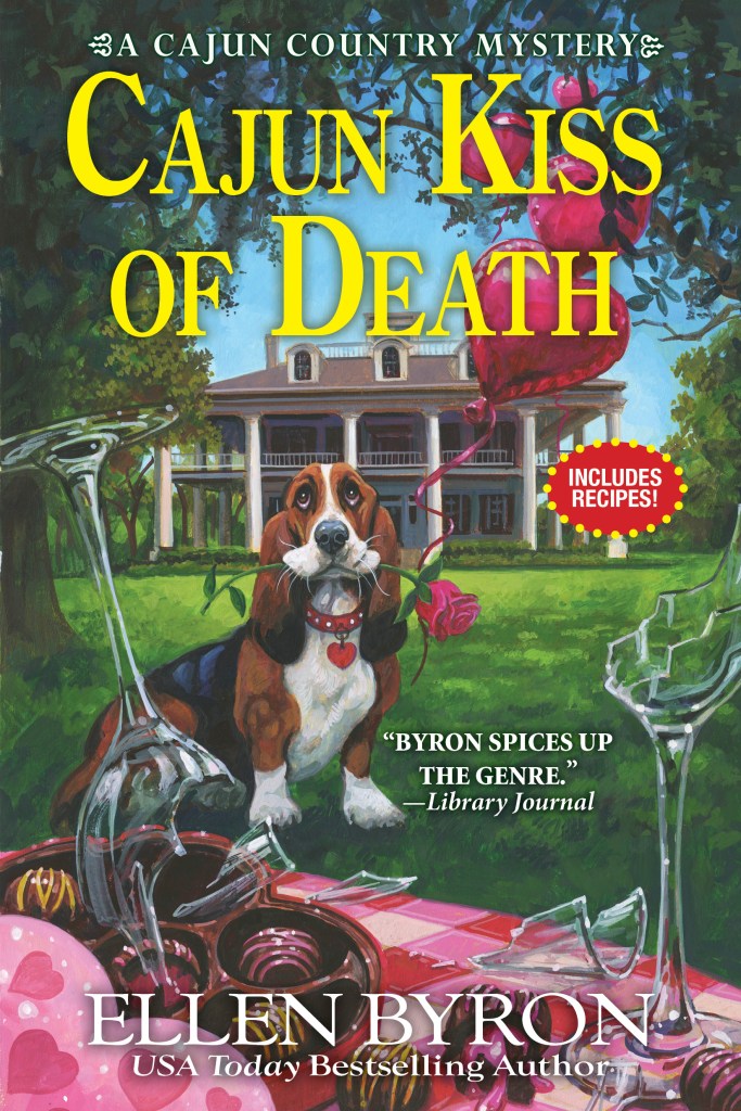
The initial cover design for my first book, Plantation Shudders was wildly off. Instead of a bucolic Louisiana setting, there was the side profile of a guy in a fedora in front of broken shutters like the book was a 1940s noir instead of a cozy. The publisher owned the misdirection. But after that I took to giving detailed cover suggestions to my publishers. And luckily, they want to hear them. Recently, I’ve even used clip art to make rudimentary images to illustrate what I’m thinking, like here, for the cover of Cajun Kiss of Death. The final product doesn’t look anything like my images, but you can see some of the suggestions incorporated.

•JC Eaton—
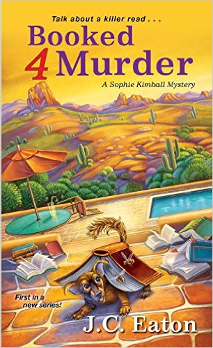
The original Booked 4 Murder had a multi-colored Chiweenie which was later changed to a brown one. The basic design did stay the same. We actually liked the first, but it was up to the publishers. Our editor deserves the kudos for getting us to add the dog to the series. Turns out Streetman is a big hit with readers!
•Kate Lansing—
I’m so thankful to have connected with the mega-talented artist who illustrates the covers for my Colorado Wine Mystery series, Samantha Dion Baker, and always appreciate seeing the original artwork versus the final cover. The cover art for Mulled to Death has changed the most, the brilliant Berkley design team tweaking the colors to make them more vivid and fitting with the Valentine’s Day theme of the story. I love seeing them side by side because it really helps show that it takes a village to bring a book into the world.


•Claire L Fishback—
Book cover #1: My own creation. I entered my book in the Kindle Scout program and needed a book cover so people could vote for it. I painted a spooky landscape picture to use as the background (back then, I didn’t know anything about stock photography, Photoshop, or anything about book covers). The first version of it had “by Claire L. Fishback” like I was some novice, the wrong color text (as you can see), not to mention the wrong size and style of font.
Book cover #2: I decided to go Indie, but I wanted to do it the right way and hired a professional book designer. I used the same background painting, but she worked with it to make it so much better. As you can see, she made the focus of the cover the font and title.

• Karen Docter—
When I decided to go Indie, I didn’t know a thing about covers, so, I didn’t even attempt to do my own. However, I was already published as a contemporary romance author and had a cover artist I really liked. So, when I branched out into romantic suspense, she did my cover. I thought it was good, but realized it didn’t fit the genre the same way my contemporaries did. I ended up participating in a romantic suspense box set, and the organizer had her own cover artist. I loved what she did so much, that I approached her to redo my Killing Secrets cover. My contemporary cover artist is a friend and I asked her if she minded. She said she didn’t because she knew the contemporary romance genre, but wasn’t as comfortable with romantic suspense. Needless to say, I was thrilled with the redo. It fits my book so much better.


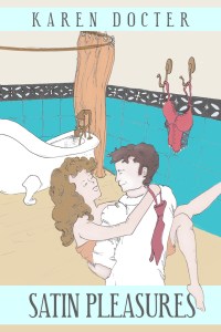
I have another example with my first romantic comedy release, Satin Pleasures. At the time, there were still a lot of cartoony covers for romantic comedy so I had a local artist do my first cover. It did well enough, but when I decided to re-cover Killing Secrets, I had my friend (the whiz with contemporary covers) redo Satin Pleasures as well. When it went public, I got my first bestseller.

• Jennifer Chow—
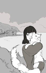
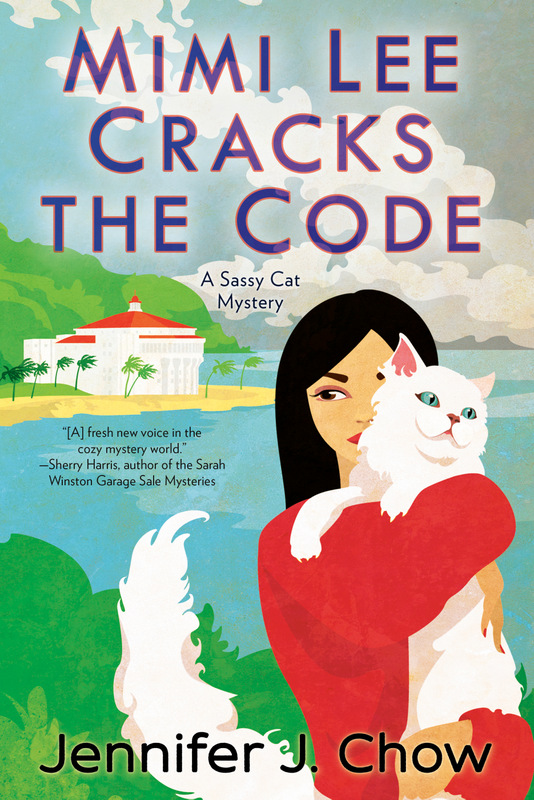
Since I’d taken a trip to Catalina Island, which plays a role in Mimi Lee Cracks the Code (launching November 30, 2021), I sent my publisher my vacay photos for inspiration. I’m glad the artist used the iconic Casino building in the illustration. From the initial design to the final cover, only minor changes were made. Mimi’s face looks different, and her hair grew longer. Plus, the added clouds in the background appear more ominous. The finishing touches had to do with the font. We went through a few variations of color combos before finding hues that would make both the title and author name pop.
Readers, how much time do you spend looking at a cover? What do you think of these redos? Do you judge a book solely by the cover when deciding to read or purchase? Did you already realize how much effort goes into cover design?

It’s worth all the effort that goes into covers. Sometimes when I’m looking for something to read and I don’t know what I want to read, it will be a cover that attracts my attention and/or a title. Love a clever title too.
LikeLiked by 5 people
Oh, definitely! I love a good title too. If it’s funny, I assume the book will amuse me as well. I have a ton of books on my TBR pile, so I don’t browse very often, but when I do, it’s cover, cover, cover all the way!
LikeLiked by 3 people
One thing I know about covers in my genre (mystery and crime fiction) – they’re all over the place. They feature photos, drawings, covers that have little illustration but lots of color, and even some plain, dark covers. If the writer is a branded author, their name is the most prominent element on the cover; otherwise, it’s the title. Some of the illustrations depict things important in the story, other do not. Cozies tend to be more consistent; all feature a cartoonish cover rather than a photo, although the drawings can range from almost a child’s scribbling to watercolor worthy of an art gallery. Animals and food are also common elements. It’s instructive to pull up the covers of the top 50 books in your book’s category on Amazon – you can do that by clicking on the category name under Product Details on your Amazon book page – and see how they compare to your book’s cover. If your category does have consistent covers, it’s wise to have yours follow the pattern.
I design my own covers. My main concern is that I have a picture that grabs a prospective reader’s interest and depicts a scene or an element important to the story. Since I’m not a branded author (yet!), my title is the most prominent element. Each title in the series ends in an exclamation point to link the books together as a series. The background is black because my stories are dark, and it makes the brightly colored pix I use stand out all the more. I use a consistent font, again to link the series together. Comments I’ve had about my covers mirror those I’ve had about my books – people either love ’em or hate ’em. So I must be doing something right! If any of you would care to comment on my covers, have at it. I’ve got a pretty thick skin.
LikeLiked by 2 people
That’s exactly what Karen was talking about with her cover. It didn’t quite fit the genre anymore but when she fixed it—BAM—bestseller! Covers absolutely need to fit the genre, and research is so important.
LikeLiked by 2 people
I went to look at your covers, and all I see on your “The Books” page is this type of window repeated over and over (probably once per book): “Firefox Can’t Open This Page. To protect your security, read.amazon.com will not allow Firefox to display the page if another site has embedded it. To see this page, you need to open it in a new window.” Thought you might want to know.
LikeLiked by 1 person
That’s a message I’ve never seen before! Good luck, Tom!
LikeLike
Thank you, Marla! This is new – the covers, and a link to Amazon to buy, were visible a few weeks ago – my newest book, Killers!, was released on August 9 and the site was working a month later. This looks like a new wrinkle imposed by Amazon, maybe to prevent authors selling their books off-site. BTW, it’s not just Firefox; Google Chrome won’t display the covers and links, either. Looks like I’ll be calling Bluehost and Amazon tomorrow to see what I can do about it, if anything. I swear – don’t we authors have enough difficulty selling books without crap like this? BTW, you can see my covers on my series page on Amazon.
LikeLiked by 1 person
Best of luck getting things sorted, Tom! I feel your pain. I had to redo my entire website two months ago thanks to my site provider deciding to upgrade and no longer support their old system. It took forever. Supposedly they improved things, but I much preferred the old site. At least they told me they were changing things though! Nothing worse than accessing your website one day to discover something broke through no fault of your own.
LikeLike
Aargh! What a pain! Hope getting it fixed doesn’t cause too many headaches.
LikeLiked by 1 person
Well, I got my web page updated, but I no longer have a live link to my Amazon Buy page. It turned out that you could open the old pages in a new window and see the Buy button, but most people who saw the error message would do exactly as Marla and I did; decide it’s not worth messing with and go elsewhere. Thanks for your support, Amazon! (Not!)
LikeLike
If you’re interested, here’s the new page: https://www.3mdetectiveagency.com/books/
LikeLike
What a fun post! I love cover art. I think it absolutely can make it break a book. I feel that as both a writer and reader.
LikeLiked by 2 people
Totally agree, Ellen. There’s a really mean—but instructive—blog out there that shows and deconstructs terrible covers. And there’s a facebook group (probably many) for designers all about covers with constructive feedback on what’s not working and how to make it work. Fascinating stuff to this non-artist!
LikeLiked by 1 person
Oh, yes- I’m a “cover girl.” If it’s a new-to-me author, you best believe I go with what cover attracts me the most. Also as mentioned above, the title comes into play with me too. If you hold out two books- one called Sandfleas and the other called Sandfleas On My Fur-swirls, I’m going through door number two.
LikeLiked by 4 people
Tracy, I would read that in a heartbeat! And I’m already picturing the cover ….
LikeLiked by 1 person
I’ll get right on that ms!
LikeLiked by 1 person
Do it! Dooooo iiiiiit ….
LikeLike
Becky, so I have a pre-order before I even write it? You’re awesome!
LikeLiked by 1 person
I almost always pick up a book in a bookstore based on an interesting cover (which is why we not only need good covers, but brick-and-mortar stores, as well!). I still need to like the first page or two of the book to actually buy it, but unless I know about the book beforehand, it’s gotta have a good cover to catch my interest.
Fascinating how they changed Mimi Lee from being Manga style to not-Manga on your cover, Jen.
LikeLiked by 4 people
I thought that was interesting about Jen’s cover too, Leslie. I noticed they made Mimi look older and more exotic. On my third Crossword mystery they went the other direction and made Quinn look so much younger.
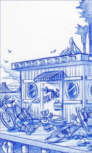
And on your cover I think it’s interesting how they left the bicycle the same, but flipped the restaurant. I guess it makes more sense with the direction of the pier and the shoreline, now that I study it.
LikeLiked by 2 people
Yes, it’s so interesting how the art transforms from the first sketch to the final image!
LikeLiked by 1 person
The sketches on these examples are all so pretty!
LikeLike
Like Tom, I design my own covers. Sometimes that’s my favorite part of a new release. It’s a great way to procrastinate on actually writing the book! Some of my early covers were awful. Luckily I’m free to change them whenever I want (or, more accurately, whenever I find the time to redesign them).
LikeLiked by 3 people
Marla, I’ve always loved your covers. They really pop and the branding is spot on!
LikeLiked by 1 person
Thank you, Becky!
LikeLiked by 1 person
What a wonderful post, Becky! I find covers fascinating and will always gravitate to a book with great artwork on the front.
After reading about all these examples, I am doubly in awe of the hard work that cover creators put in to make an enticing package.
LikeLiked by 2 people
Right?? I totally used to take them completely for granted! No more.
LikeLike
It’s neat to see all the before and after cover art, Becky! It’s also surprising how much difference even a subtle change can make!
LikeLiked by 2 people
So true, Vickie! Owning a printshop, I’ve done plenty of design work in my time, but the things that real artists can do is impressive.
LikeLike
I like the green chair better
LikeLiked by 1 person
Thanks, Dru! It’s pretty obvious it’s a Christmas story even without the green chair, but I wanted it to pop a bit more.
LikeLike
I really like the artful covers and do not like the animated ones and don’t like many of the photography ones, but some of the above were very good. The Devil is in the details!!
LikeLiked by 1 person
It’s always interesting to me when a cover really strikes me or really turns me off. Sometimes the reason is obvious, but sometimes it’s completely subjective. “I don’t like that color.” … “I hate clocks on a cover.” … “That needs a dog.”
LikeLike
First, Police Navidad is an amaaaaaaaaaazing title!! I love it so much!
Secondly, these cover backstories are the best! It’s so interesting to see the first iterations and the final product.
Count me among those who get pulled in by the cover art and jacket copy. It’s not too dissimilar from how I pick wine.
LikeLiked by 2 people
Books and wine… my type of friend!
LikeLiked by 1 person
LOL! Thank you! I always love the backstage peek at anything! And yes, some of those wine labels are completely inspired.
LikeLiked by 1 person
Oh my gosh, I LOVE seeing all of these covers! Wow!!
Becky, did they explain why Quinn’s hair color and style changed so much? Were they just like, yeah, she had a spa day? 🙂
LikeLiked by 3 people
I never even asked, Cynthia. By the time I saw the final version, it was already on Amazon!
LikeLiked by 1 person
I can’t even remember what I was Googling tonight when I stumbled on this site, but what a lot of fun! I’ve been exploring all of your books for over an hour. I’m a cozy reader and working on breaking into the genre as a writer, coming from a contemporary sweet romance background. When I read that you use Steven Novak for your covers, I laughed out loud. He’s my designer too! Great to work with, VERY patient. 🙂 I look forward to reading more posts and more books from this group.
LikeLiked by 3 people
Hi Denise! Welcome to our little cozy corner! Steven came to me by way of a recommendation and I was mentioning that to someone who said “Oh, I referred him to her! And I got the referral from someone else.” Word-of-mouth is a powerful thing, eh?
I hope you added your email and clicked the “follow” button for Chicks on the Case. And I think we all have newsletters you can subscribe to …. hint, hint.
Best of luck with your writing! You’ll enjoy the cozy community, very welcoming and a ton of fun.
LikeLiked by 1 person
Denise, We’re so glad you found us–and we’d love to have you as a Guest Chick when your first cozy comes out. Good luck–fingers crossed for you!
LikeLiked by 1 person
I did! Thanks, Becky 🙂
LikeLiked by 1 person
I have nothing but awe and appreciation for designers–and authors who design their own covers, too! It shocked me a bit to learn in my first job that cover artists didn’t read every author’s ms. page-by-page, lol.
LikeLiked by 1 person